Overview
There are two places in the app where you can change how a sensor's chart is displayed. Both let you change the chart type, for example between a bar and a line chart. The important difference is what happens to the change: a change made from a group or object view is saved, while a change made from a sensor's details is temporary. A sensor's details also offers a few extra options, such as comparing several sensors in the same chart. This article shows you both.
"Change visualization" controls how the data is presented, for example as a bar or line chart. It does not change the data itself, only how you see it.
Permanent change: from a group or object view
When you open a chart from within a group or object view and change its visualization, the change is saved and stays that way the next time you open it. Open the group or object view, open the chart for the sensor, click the three dots (⋮) on the chart, and select "Change visualization" to switch between chart types.
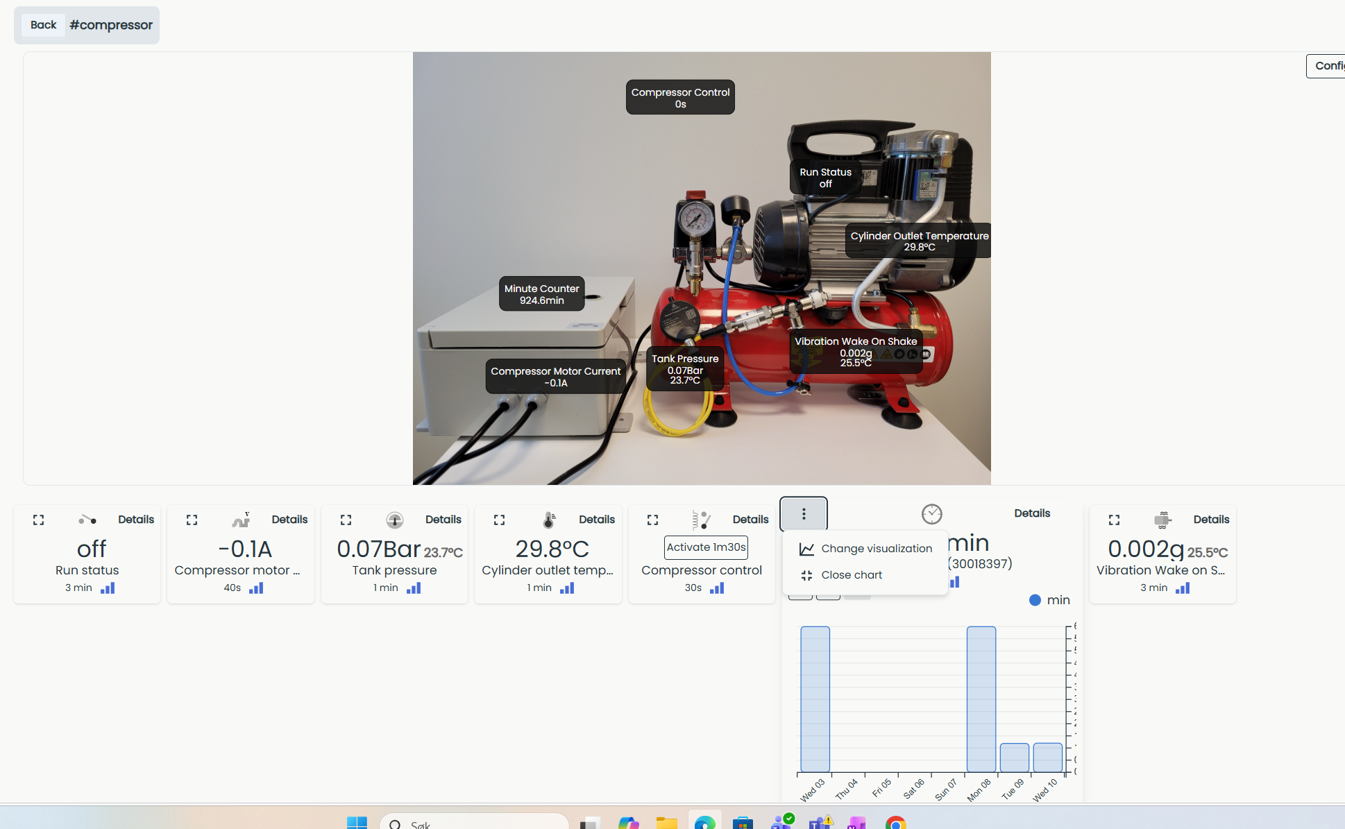
This setting is saved for your user only, not for the whole system. Every other user of the same system keeps their own visualization until they change it themselves.
Temporary change: from sensor details
You can also change how a chart looks from a sensor's details page, but this change is not saved. Open a sensor and go to "Details", click "Chart options", and adjust the settings, for example aggregation, accumulation view, filtering, grouping, or comparing several sensors in the same chart. For a full description of the sensor details page and its chart options, see Details.
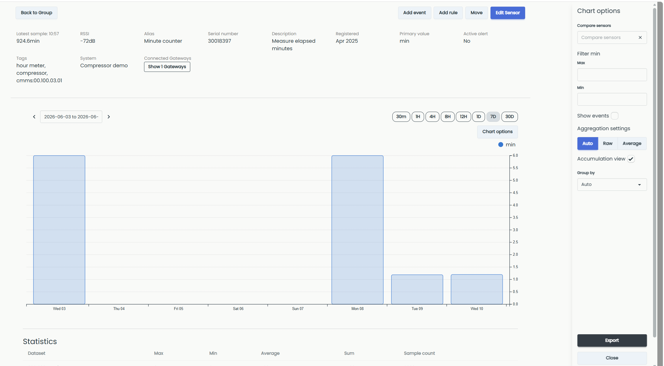
These changes reset when you leave the details page. The next time you open the sensor, the chart options return to their defaults.